 For the purposes of this article, I’ll refer to linear narrative as a story with a beginning, middle and end. Think of it as going to the theater to watch a movie. You go into the room and the movie starts. You might be watching “Memento,” a traditional nonlinear screenplay, in which the movie goes forward and backward in time. But as a part of the audience when you see “Memento,” you go to the theater and watch a story, without interruption, regardless of how the story is told. It unfolds for you in a linear fashion.
Likewise, when describing nonlinear narratives, I’m not referring to their timelines but to interruptions of the story experience, as if you went to the movies to watch “Memento” and were interrupted in the middle by a documentary about the film itself.
Interrupting stories
Take a minute to think about a great lecture you’ve attended sometime in the past. What made it a brilliant storytelling experience? Apart from content and the speaker’s ability to deliver a good story, a good lecture is a linear flow of information, with a beginning, middle and an end. Those are the basics of a story; we’re familiar with them from an early age.
Let’s look a little deeper. At the beginning of a lecture, the speaker will introduce a subject step by step. Most talks these days are accompanied by visual aids, with the speaker sharing either the key points of her talk or visual information that clarifies the knowledge that is being shared.
Now imagine yourself in a lecture hall. The room is packed and the upcoming talk is the one you came to hear. The subject is something you are interested in, and the speaker is the best in the field.
The lights go out; the audience is quiet except for a cough here or there. The speaker takes the stage with an ovation.
She begins by introducing her subject. The speaker metaphorically takes the audience by the hand, strolling around. All of a sudden, in the middle of a sentence – “and so we can conclude that…” – the speaker stops. She then says, “You know what? I’ve just remembered that I have this amazing picture somewhere on my computer that relates to this subject.” She finds the picture and displays it for the audience. It does make sense, and the picture has added another layer of information. But then, after she shows the picture, the speaker starts talking again, right where she stopped the sentence before.
Now imagine that this talk, the one you and the rest of the room were really looking forward to, continues to be interrupted again and again. The speaker keeps throwing in stuff that relates to the subject and the story, but with no regard for the interruptions.
The storytelling would be awful. The narrative would be a mess.
Here’s a graphic visualization of such a narrative:
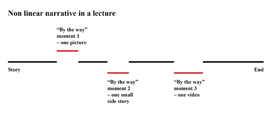 This example likewise illustrates how we present or consume news on most distribution channels right now. In print, because of physical space constraints that pages impose and the way graphic design copes with them, the presentation and consumption of a story become a nonlinear narrative experience. Pictures, text, captions, etc., all relate to the story being told, but the way the bits of the story are laid out reinforces its nonlinearity.
Consider the following layout of a magazine story. It has some of the content you would expect from a magazine: flowing text in columns, pictures with captions, graphics and a box with a related story.
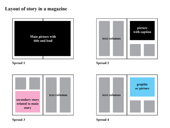 Every aspect of this story is related to and enhances the information being communicated. But since we are presenting all of this content on eight pages, some compromising must be done. Graphic designers must find the best way to make this story presentable, readable and compelling. Working within the physical boundaries of pages, the text is set in columns and flows from one spread to another without much control over where it breaks from one column to the next, from one page to the next, or even from one spread to the next.
Furthermore, in order to lay out all of a story’s elements, designers must ensure that a graphically “important” element is presented on each spread. This means that the pictures of the story will be placed on the spreads to favor visual enhancement. The same happens with the secondary story and the graphic in our example.
What does this mean for the reader’s linear narrative experience? Since every bit of the story is laid out across the spreads, pictures and other relevant information will rarely be presented in the best place for the storytelling experience. Readers will have to stop reading the main text to absorb the picture information, or will have to read further until they find a “safe” place to stop reading the main text and thereafter read the secondary story, etc. The narrative is a broken one, and representing it in a graphical way would resemble the previous representation of the bad lecture.
On most websites, sadly, the same nonlinear experience takes place. Sites present stories using a top picture and a scroll-down text column. If the story has secondary pictures and texts, these items are presented alongside the long column of text or, in the case of secondary pictures, by making the top picture a slideshow. Even on the iPad, most publishers approach tablets using a print or a web paradigm.
Optimizing interludes
It doesn’t have to be that way. Let’s go back to the first example and imagine a good linear narrative for a lecture. Here’s a graphic visualization of what it might look like:
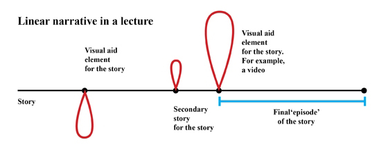 In a good storytelling experience, a linear one, each item that exists to aid the main story is placed in an ideal location. For example, imagine a story about a family facing economic stress. Suppose it includes a video of a family member talking about how having been fired made things worse. In a linear narrative experience, the video would only be presented to the audience at a certain point in the main narrative. When telling about how the family was facing stressful problems not only because they lost their savings but also because a family member got fired, that would be the place to show the video. Think about it as a part of a lecture: “Let’s see a video on why losing her job only made things get worse.”
The main narrative of a story can be imagined as a string of scenes or episodes, like a TV series, where every added item is placed either at the beginning or the end of each episode. Every episode is structured so that it can be interrupted without breaking the narrative thread.
With the story broken into scenes or episodes, you can then place additional material in the intervals. You can break the blocks to have the intervals where you want them – before and after scenes, wherever it makes perfect sense to add the story-enhancing media. Clever tricks exist in television to cope with the temporal “amnesia” that audiences face on consuming a story in sequential blocks. You can use similar solutions to create a linear flow, once you’ve used the spaces between scenes for added material.
Digital narratives
But how can we do this on a digital distributing device? The most important aspect of a story is the subject of that story, the content. It follows that if we want to change the way we tell our stories, we’ll have to start with that basic concept. Every storyteller must first come up with the content. She then will be able to break the story into blocks, or episodes of content – not only for the main narrative, but also for the added material. For each episode, the storyteller must decide on the best technique to communicate her story. In a digital narrative, storytellers aren’t obligated to choose text over audio, or pictures over video. They must choose the best way to communicate each part. The choice should flow from the content itself. Added material for a story must be presented in a way that can either be fully explored by a reader or moved through without losing the narrative thread.
The final linear narrative will be a flow of content, presented using every digital tool available. Using a TV series season approach, the storyteller will present her story, one episode after another, in a way that will not break the flow of the narrative, regardless of the technique used for each episode. Each part will be placed after the previous one, at an exact point in the story that best maintains flow. Intervals will be used for added material. Readers will be able to choose the amount of time they take to consume each episode of the narrative.
We need to radically change the way we tell our stories. It doesn’t make sense to keep using old paradigms on new devices. Our main goal is to learn the best way to tell a story and stop using techniques that worked only for one platform (be it text and pictures in print, video on TV or audio on radio). With digital distribution we can mix all these techniques in a way that enables our storytelling. Those of us in newsrooms also need to change the way we plan, produce and present our stories.
Here are a few iPad applications that do a great job nailing this kind of storytelling:
 France24’s “Rape in Congo: Peace Violated” is more than a year old. It comes from the early days of the iPad but provides a nice example of a linear narrative. You can see the TV documentary roots of this application, but it also draws from the feel of a magazine.
The narrative begins with examples of rape stories and allows users not only to read information but also to hear, firsthand, stories from the victims themselves. Using strong pictures to set the mood, every now and then readers encounter audio or video. Text introduces each chapter of the story.
Users learn about the rapes, the medical and psychological support given to victims, and the medical and judicial efforts to find and punish rapists. There’s a look inside a court hearing on a rape, a visit to a Congolese jail and, finally, a look at how things are outside the big cities. This application delivers a powerful, terrible story.
 The second application I want to highlight is “Money & Speed – Inside the Black Box,” by VPRO (a TV broadcaster) and Catalogtree (a data visualization studio), both from the Netherlands. This app takes us inside the finance world and the fastest and deepest U.S. stock market plunge ever.
“Money & Speed” uses video as its core narrative medium, but what’s really innovative about its storytelling approach is the ability to stop the video and explore interactive data graphics about the stock market plunge. Every time a new data set is discussed on the video interviews, the app allows readers to open and explore it. Yet if someone doesn’t want to explore the data visualizations, the video chapters by themselves suffice to tell the story.
 The project that comes closest to the approach I’m advocating is the Atavist, a publishing house for long long-form articles (described as 6,000-30,000 words). The Atavist offers the possibility of enriching a narrative with supplementary text, pictures and videos.
These added elements can be presented in a linear fashion – on a screen by themselves – or within the text via highlighted words. This approach to producing (mostly) text-based narratives allows for a wonderful storytelling experience on a digital device.
Let’s take one of the Atavist’s articles, “Lifted,” as an example: the tale of one of history’s most elaborate heists and the race to unravel its mysteries. The storytelling experience begins with a video of the robbers in action, filmed by surveillance cameras on site. The video helps to set the mood of the story. Swiping the page, the user can start reading the article. Important relevant details – such as a Google map with the locations mentioned in the article – appear when users touch a word in the text related to the information.
The story is written in chapters (episodes), and between these chapters at strategic points, users are presented with pictures related to the previous chapter. In “Lifted,” the storytelling is enhanced with videos, related texts and pictures. Users can also opt to hear the author narrate the story.
 The final app I want to share is “The Fantastic Flying Books of Mr. Morris Lessmore,” by Moonbot Studios. A simple kids’ story about people who love books and the way books return their love, this application offers a digital narrative approach that goes beyond what is usual on iPad book apps. Each page is filled with a big picture and some text. Most of the pictures offer interaction and animation.
Furthermore, sometimes users must interact with the picture and discover small “secrets” in order to turn to the next page. At other times, such as with a playable piano, the interactivity on a picture is there just for user enjoyment and does not directly advance the narrative. This moving story is filled with wonderful illustration and animation, and is one of the greatest examples of thinking outside the box when it comes to digital storytelling for the iPad.
The fact that a few storytellers have taken advantage of digital opportunities to structure great linear narratives that flow – narratives whose possibilities we could only have imagined in the past – should encourage us all to rise to the possibilities of these new platforms.
Pedro Monteiro is a graphic designer who has worked in the publishing business for more than 14 years, mostly at the Portuguese newsmagazine Visão. Named one of Businessweek’s 21 Heroes of Data Visualization in 2009, he blogs at Digital Distribution and is a consultant with Innovation.
Monteiro would like to thank Barry Sussman for his edits, Vasco Ferreira for his “lecture” insight, and Joana Maciel for her assistance with this article.
