Anyone who’s taken a shortcut and skipped the primer while painting a room knows the kind of results you can get. Uneven. Unpolished. The primer sets the stage for a beautiful wall.
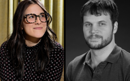
That’s kind of the idea behind the storytelling website Primer Stories, says Tim Lillis, one of the creative minds behind the site, which mixes medium-form written pieces with lots of eye-catching visual effects.
He thinks the stories should be just long enough to prime readers on the subject – about 1,000 words -- while also acting as a primer of intellectual paint.
Story topics can be ambitious, but Lillis and co-creator Joe Alterio were intent on crafting narratives that are digestible for both longform lovers and listicle lushes.
“We realized that somewhere along the line, the important ideas were losing the battle of marketability,” Alterio says. “So, how do we give them a little bit of that flash while still retaining that core, essential part of the idea?”
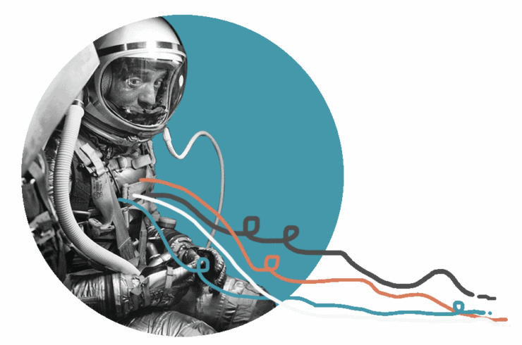
For Alterio, the former animator who now works as an interactive designer and creative director, the site is akin to a “visual podcast.” And the stories do feel like they could be narrated by Ira Glass, with the written word interspersed with images, GIFs, digital collages and all manner of wacky -- but striking -- animations. (For example, in a recent story, a traced outline of a rat gradually morphs into an X-ray view of the rat as you scroll down the page.)

Lillis, a jack-of-all-design-trades, compares the site’s pieces, or “primers,” to a tapestry woven from a written story and an illustrated story, two parts working together to make a greater whole.
The site works like this: Stories are published as part of a “season,” 10-episode arcs that are organized around a theme and dripped one by one onto the site. Each story feels entirely bespoke but also feels part of a larger whole.
On the spectrum of digital media innovation, it can be difficult to see where, exactly, Primer Stories fits in. On one end, there are longform stories with cascading designs, state-of-the-art graphics and photography. On the other, there are 3D videos, podcasts and virtual reality journalism.
Primer Stories falls somewhere in between, which Lillis and Alterio see as an overlooked niche.
“We realized that somewhere along the line, the important ideas were losing the battle of marketability. So, how do we give them a little bit of that flash while still retaining that core, essential part of the idea?”
They talked by phone about trying to stake a claim in that niche. Their answers have been edited and condensed.
What’s the origin story behind Primer Stories?
Joe: Tim and I have been friends forever. We grew up together in Massachusetts, and we’ve had our aesthetic interests coalesce because we’re interested in a lot of the same things -- art, comics and drawings and stuff like that -- and we started this project because we’re both of a certain age where we remember the web being a little stranger and more idiosyncratic. The past five or so years, we were pretty dismayed at how templated the web had been getting, especially when it came to sharing important ideas that should be reaching a wider audience. We thought we might employ our skills as storytellers and illustrators and we thought we should try our hand to make the web a little closer to what we want it to be.
You describe Primer Stories as a visual narrative start-up. Can you explain to someone who may have never heard of you what that means?
Joe: I think that people like us and our intrigued by us, and not to toot our own horn here, but people see the site and say: "Wow. I’ve never seen anything like this, ever." I think it’s because we’re taking a lot of sensibility from stuff we love. We lean really heavily on podcasts, really heavily on comics, infographics and cartoons. We’re into bringing aspects from those things we know into the web storytelling space. I think the best descriptor might be what someone else gave us a little while ago: a visual podcast. We’re very story-oriented, we’re very theatrical in nature, we have opening themes and we have pauses and beats in the conversation. It just so happens that we’re plotting it out in a kind of storyboard on the screen.
Tim: We’ve actually tried to get away from that description, because it never works. People are like, ‘Cool! How do you listen to it?’ I think the example of something like Radiolab is really helpful. The way they paint the scene with audio samples and really build the world the story takes place in, I think that’s a good metaphor for what we’re doing with our illustrations. It’s not necessarily just art that illustrates the text. It’s something that helps craft the world and tells a complementary story alongside the text.

What’s the business model right now?
Joe: The business model is something that’s only hit upon in the past four or five months or so. When we first started this, it was just a project, and it started to pick up steam and get traction. Like a lot of online editorial places, we were thinking about native advertising, but we weren’t comfortable blending that with our editorial. We’re not a clickbait venture. We’re more bespoke, so we don’t do enough content to “bury” the native advertising. We hit upon the idea of [also being] a work-for-hire studio, which would be an entirely different project from our editorial, in which we collaborate with companies or foundations.
We’ve got a couple irons in the fire. Our hope is that we have two distinct parts of the venture. We make money with the studio, which funds our editorial efforts. Our hope is that we find different partners who understand that we are good at taking a very complicated idea and making it relatable, so that’s our ultimate goal, whether it’s foundations or government organizations or scientists or something like that.
How does it work with the writers?
Tim: We put out a call for submissions when we finish a season, saying, “Next season’s theme will be so-and-so, and we would love to hear from you if you’re interested in writing something.” It’s a combination of people who come to us and then we also reach out to people whose work we really admire and would love to be able to work with. They usually give us a draft, then we develop the story from there. We see ourselves as kind of film directors. It starts with a screenplay -- their story -- then we break it down to find out how scenes might work and what particular discrete moments are there that should have a distinct feel. That’s our process on our end, applying that visual pacing to go with the story pacing. Joe and I then get together and get into the nuts and bolts of art direction, trading sketches and ultimately come up with what we’d like to think is a very cohesive presentation of the story.
Joe: And there are times when people come to us, like in the “Dragons of the Alps” piece by Anindita Basu Sempere. She kind of came to us with this, and it was nearly perfect. We had to do very little work on it. Then other times, people come with an idea or a general stab in the direction, then we have a lot of editorial back-and-forth.
Despite your taking some techniques from other digital longform, none of your stories would qualify as that. Do you hold to a specific word count?
Joe: The way the stories started playing out, we realized that at a certain point, considering the amount of richness of visuals and stuff like that, we can’t necessarily overwhelm it. We started to fall into this 1,000- to 1,400-word ballpark, and so far it’s seemed to work out correctly.
When I think about journalism as it stands today, there seems to be traditional digital or print writing on one end of the spectrum, and then on the other you’ve got it stretching out to video, virtual reality, innovative podcasting, those kinds of things. You seem to shoot for somewhere in the middle, where you’ve got the written word with some graphics where you scroll down. Was that intentional?
Joe: To answer the second part of the question first, yes. I would say that one of the biggest things that we run across is having to really show people the site to get them to understand what we’re doing. I will say that once people see it, they say: "Oh, this is great. I totally get it, and I can’t believe that stuff like this doesn’t exist more." That tells us that we’re doing something right. As far as why it hasn’t happened yet, I don’t know, honestly.
But you were intending to kind of capture that space? You say on your website that you were looking to have more digestible piece than what we traditionally think of as longform.
Joe: Well, when we do market research on social media and look at what’s out there, as much as I would like to say that when someone posts a 6,000-word piece in The Atlantic that gets 70 likes, the answer is no. It gets a few likes, and they get one person commenting saying, “So sad!”
Tim: It’s the way that things are becoming so visual across the board. And that’s not just laziness. There’s a lot of studies that show that people actually do retain the information when it’s paired with visual experiments. We definitely saw an opportunity to run with some of our strengths and say, “We’re interested in a lot of these things,” but we don’t necessarily have the time to find where they’ll be. That doesn’t mean we’re not interested in the content. So what’s a way to get some of the stuff that’s hiding in plain sight to people who have that interest and that passion but just aren’t able to find it? We’d like to think we’re making the stuff that’s a lot more obscure much more accessible.


