More than a few journalists have dreamed of turning their stories into films. Chicago Tribune features writer Kevin Pang actually did, producing a 90-minute documentary about a troubled chef’s attempt to open the country’s best restaurant. In the latest installment of our regular feature, “Writing the Book,” redubbed “Writing the Film” for this essay, Pang discusses the challenges-- and revelations-- of translating print narrative to a visual medium. To learn more about the film, “For Grace,” click here.
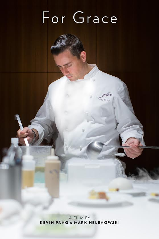
For the better part of the past four years, my life has revolved around a Chicago chef named Curtis Duffy.

What began as an idea for a short video for the Chicago Tribune website turned into an 8,000-word feature story, and now, a 93-minute documentary I’m taking on the film festival circuit. With the exception of the woman who went from my girlfriend to my fiancee to my wife during the course of the filming, there wasn’t a human being I got to know more intimately than Duffy.
When I first met him, Duffy was about to leave his job as head chef for a high-end Chicago hotel to open his own restaurant, one he hoped would become “the best in the country.” Duffy’s resume, which included stints at the internationally renowned Chicago restaurants Charlie Trotter’s and Alinea, among others, suggested he might have the skills and ambition to pull it off.
As the Chicago Tribune’s dining reporter, I thought there might be a compelling story in his quest to open America’s best restaurant. But I wasn’t sure it was a print story. The process of building a restaurant felt more procedural than emotionally compelling, and not the type of Thomas French or J.R. Moehringer page-turning feature I had grown up reading in newspapers. I’ve always had an interest in visual storytelling, though; I studied broadcast journalism in college and had a grasp of shooting and editing video.
What, then, about a short film? Duffy agreed to cooperate and, my filmmaking partner Mark Helenowski and I began documenting the birth of a restaurant, one that would be named Grace.
We envisioned the piece as a short, standalone online video for the Tribune, paired with some online text components. Transitioning from storytelling with words to moving pictures required me to exercise different creative muscles. The two biggest challenges: Finding a cohesive theme, and structuring the film.
First, it didn’t take too many sessions of filming the new restaurant crew testing out dining room chairs for me to learn that visually documenting the building process wouldn’t be enough. The realization hit: Everything I had learned about narrative writing should be applied to filmmaking as well. The story had to exhibit character volition. It had to show desire. If Duffy’s goal was to build the best restaurant in the country, to what lengths would he go to achieve that?
Quite a lot, as it turned out. I found out that Duffy, who has two young daughters, was going through a divorce, in part because of the enormous toll on his marriage of working 16-hour-plus days, nights, weekends and holidays.
Then, eight months into the filming, I found out something else. When Duffy was 18, his parents had been in process of getting a divorce when his father, on the couple’s 18th wedding anniversary, kidnapped his mother and held her hostage for 12 hours before killing her and then himself.
In his father’s belongings, Duffy found a note in which his father told him he would become one of the best chefs in the world, and advised him to take time to spend with his wife and children. As Duffy read the letter to us on camera, he broke down in tears.
We understood at that moment that, in the same way Seabiscuit isn’t really about horse racing, the film wasn’t about food and restaurants. It couldn’t just be another film with sexy close-up shots of pork belly and foie gras. We had to focus on more relatable, human themes: Sacrifice, family, relationships, balance. There was enough to make a feature-length documentary.
Los Angeles Times assistant national editor editor Steve Padilla -- my writing hero and mentor -- spent hours on the phone talking me through the story. The turning point was when he boiled down the story into one pithy sentence: “Cooking gave Curtis Duffy refuge, but cooking also exacted a price.”
There turned out to be one more surprise: a woman named Ruth Snider. Duffy had been a troubled teenager who fought and stole, until Snider, who had been his middle-school home economics teacher, helped him turned his life around. They grew closer after his parents’ deaths and she eventually became his surrogate mother. And whenever Duffy’s new restaurant opened, Snider vowed she’d be the first customer.
There it was. The heart of our story.
Once I discovered the drama behind the procedural, my editors suggested I do a print piece as well. The article ran on Valentine’s Day 2013 over five open pages in the Chicago Tribune and online here. The reporting was captured on nearly 300 hours of video.
Then came the uneviable task of turning an 8,000-word feature into a movie. Our challenge turned from thematic to structural.
Putting words onto paper is a tough enough art form, but it’s still a two-dimensional act of stringing words together. Making a movie forces you to work in four dimensions, if you include linear space-time. There are countless factors filmmakers have to contend with that writers don’t encounter: Range of shots (wide vs. close-up), music usage, dialogue vs. natural sound vs. silence, the way lighting affects mood, shot composition, the rhythm of cutting between shots, breaking the fourth wall, etc. For a neophyte filmmaker like me, much of the decision-making was instinctive. I’m not an expert.
Most of my energy, however, was spent breaking down the film -- called “For Grace” -- into a series of mini-movies. The importance of scene construction cannot be overstated.
Short of recreating backstory with professional actors or Claymation, it’s harder to present exposition as you can in print, because what you shoot is what you get. That adage of “Show, don’t tell” becomes for documentarians, "Show, can’t tell."
So the documentary couldn’t just be the newspaper story retold in visual form. We wrote down every scene we shot on Post-It notes and storyboarded the film on a massive white board. The result was a hodgepodge of nearly 75 scenes assembled in chronological order. Next came the task of weeding out the weak ones, and there were many we were pained to see go. It’s easy to fall into a trap of keeping a particular scene because the visuals were nice or someone gave a punchy quote. But our contract with viewers is 90 minutes of their time, tops, so every scene must be in service of the story. (We took solace by telling ourselves, “It’ll be on the DVD extras.”)
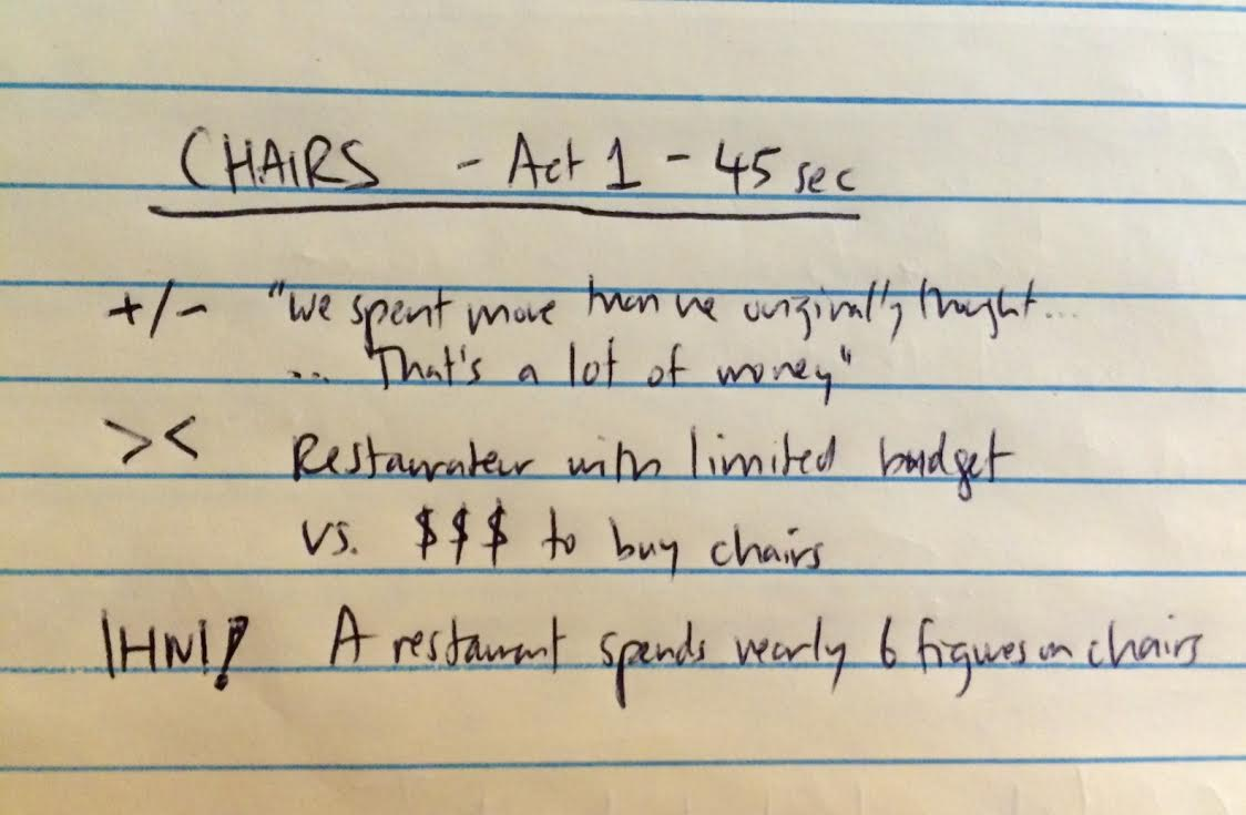
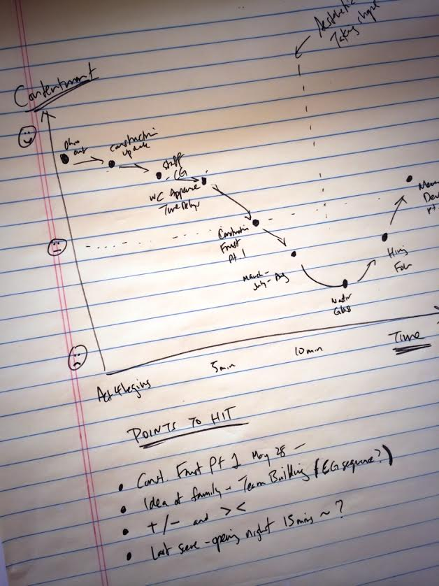
What was our criteria for a strong scene? One of the best tips I picked up was from a book called “Save the Cat” by screenwriter Blake Snyder (recommended to me by Tampa Bay Times feature writer Ben Montgomery). The book is formulaic to a fault, a color-by-numbers approach to writing Hollywood blockbusters. But one chapter about scene construction proved immensely helpful: The idea of >< and +/-.
This is Snyder’s theory: Every scene, ideally, must have opposing forces that create conflict. It doesn’t mean a screaming match between two people. Your protagonist will enter a scene with an agenda, and an obstacle gets in the way that prevents your hero from achieving that goal. Conflict is ><.
It’s a homeless father walking into a grocery store and has no money to pay for food.
Snyder also believed every scene must contain a change in emotional tone, from happy to sad, anxiousness to relief, calm to angry. That’s represented by +/-. If that emotional swing doesn’t exist, our next question should be, “What’s the point of the scene?”
A homeless father prays the grocery store manager is sympathetic enough to spare his family some food. The manager says no. The father goes from hopeful to disappointed.
I’ll add one more criterion I came up with: “IHNI!” In a documentary where we whisk viewers into an unfamiliar world, every scene should present new and fascinating information that’d make you go: “I had no idea!”
Here’s a scene from the documentary about finding the right chair for the dining room. (Note: Salty language in this scene.)
Here’s why we kept it in the film:

Laying out scenes with +/-, >< and IHNI! helped me identify strong passages and eliminate weak ones. Not all scenes will contain all three, but when I watch back a particularly slow section and can’t put my finger on why it’s dragging, this technique helps me to begin understanding why. It’s the one trick I’ve transferred from filmmaking into my daily writing career.
One last note about why you should visually roadmap your story. When it came time to assemble the film into a cohesive narrative, we adhered to Kurt Vonnegut’s philosophy on story shapes. I’ll let him explain it.
Here’s a rough sketch of the last 30 minutes of the documentary. Essentially, we begin the act with a hopeful tone, add complications to his life, really pile it on, and when all seemed lost, marched our hero toward his happy ending. The emotional arc swoops in a U shape. All our favorite stories do the same.
Books I found helpful:
+ “Save the Cat! The last book on screenwriting that you’ll ever need,” by Blake Snyder.
+ “101 Things I Learned in Film School,” by Neil Landau with Matthew Frederick.
+ “Story: Style, Structure Substance, and the Principles of Screenwriting," by Robert McKee.
+ “Storycraft: The Complete Guide to Writing Narrative Nonfiction,” by Jack Hart.